
Commercial · Brand Identity · 2025
Connexion
Client
Connexion Dance School
Agency
Selective Agency Malta
Scope
Logo rebrand + branding + visual system
Year
2025
Overview
More than a dance school
Визуальный образ для ведущей школы латиноамериканских танцев Мальты, такой же живой, динамичный и яркий, как культура, которую она объединяет
Connexion — ведущая школа латиноамериканских танцев на Мальте, объединяющая вокруг себя лояльное и постоянно растущее сообщество. Проект был реализован в команде агентства Selective Agency Malta.
Задача заключалась в том, чтобы переосмыслить позиционирование Connexion и закрепить за брендом статус главного места для занятий латинскими танцами на острове — не просто школы с расписанием занятий, а яркого центра танцевальной культуры и общения.
Существующий бренд развивался органично, однако со временем перестал отражать ту энергию, уверенность и масштаб, которых достигла Connexion. Поэтому было принято решение о полном ребрендинге: от разработки нового логотипа до создания гибкой визуальной системы, способной поддерживать ежедневную коммуникацию бренда в социальных сетях.
After

Before
Challenge
From script to system
The original logo — a cursive wordmark — felt soft and decorative. It worked in isolation but broke down completely across social media formats: too delicate at small sizes, no strong symbol, no system behind it. The real challenge was not just a new logo. It was building a visual language flexible enough for events, announcements, course promotion, and brand moments — while staying recognisably Connexion.
"We needed something that moves as fast as we do —
every week there's a new event, a new class,
a new campaign."
And critically: the team needed to use it themselves — no designer on call for every Instagram post. The system had to be self-sufficient from day one.


The idea behind the visual
Core concept
The new C is a magnet — a symbol of attraction, connection, and social pull.
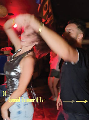
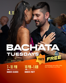
The magnet concept unlocked the entire visual language. Diagonals throughout all layouts echo constant movement — the body in dance, the energy of a room, the momentum of a growing community. The palette — deep crimson, burnt orange, warm yellow — reads as heat. It photographs well on a dance floor and scales from a 1×1 post to a full-bleed banner.


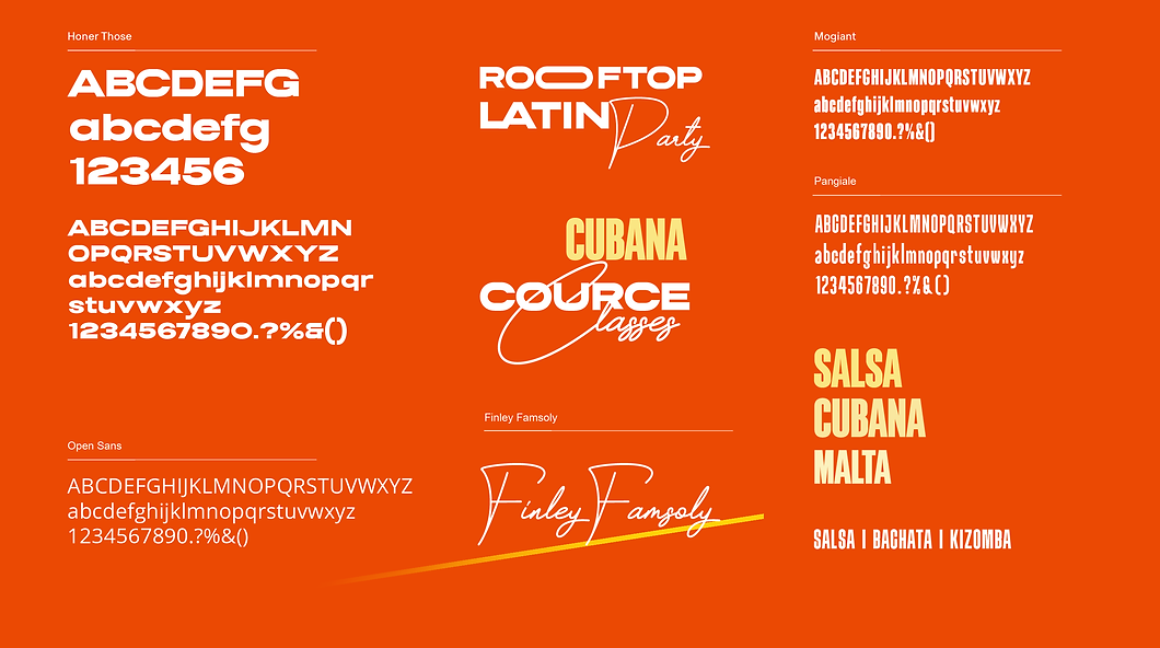
Typography system


Deliverables & Collaboration Model
How the system works in practice
The visual system was built on a division of labor: Selective Agency Malta handles strategy, scheduling, and copy; Ekaterina designs and executes the visual language — covers, typography, graphics, video editing; Connexion independently updates their weekly class schedule in a prepared Canva template.
This structure removes design burden from the client while maintaining absolute visual consistency. They don't need to make typography decisions, balance compositions, or understand the underlying system — they only update the information that changes.
The visual system itself is deceptively simple. The diagonal framework and animated typography appear straightforward at first glance. But they require a specific understanding of movement, timing, and proportion to execute correctly. This means:
✓ The brand stays visually unique — impossible for competitors to replicate
✓ Quality is maintained even with high publishing frequency
✓ The client remains focused on their content (teaching, events), not design execution
-
Social media template library (12+ templates covering events, courses, announcements, community updates, instructor spotlights)
-
Print applications (7 items: posters, flyers, gift vouchers, presentation decks)
-
Canva template system for Connexion's weekly scheduling
-
Style guide and animation specifications
-
Complete typography and diagonal system documentation


12+
Content templates delivered, covering every format used by the school and designed for easy in-house editing.
7
Print applications: Seven print deliverables created to support both internal communication and audience engagement, including presentation decks, promotional posters, flyers, and gift vouchers.
6 wks
Project timeline


Impact
Numbers and Impact
COMMISSIONED BY SELECTIVE AGENCY MALTA
Role: Led concept development, art direction, social system design
EU context: Part of Mediterranean creative market growth
SCOPE IN NUMBERS
+30% follower growth
700+ social followers
Team uses templates daily — zero design support needed
POST-LAUNCH METRICS
According to the agency owner: “Within two months, our content strategy
tripled both the page traffic and overall content views.
Timeline diagram: 07.05.25 Discovery → 25.05.25 Design → 01.06.25 Handoff → 01.06.25 -01.07.25 Adoption
"What impressed us about working with Ekaterina was her understanding of how a design system actually lives in an agency workflow. She didn't create something beautiful and hand it over — she designed for how we actually work: clear separation of content strategy from visual execution, simple interfaces for the client, invisible architecture that ensures quality at every touchpoint.
The school edits photos and updates text in a prepared Canva template — it looks simple. But that simplicity exists because the underlying system is sophisticated. The diagonal logic, the typography proportions, the spacing rules — they're embedded in the framework itself. That's what prevents dilution of the brand while keeping production sustainable. And it's what means the system stays in our hands to evolve."